Everything You Need to Know Before Designing an Interface in Dark Mode
For a while now we’ve been seeing the emergence and increasing popularity of interfaces designed in dark mode. You’ve probably noticed that most web browsers already give their users the option of selecting their preferred interface, either dark mode or light mode.
However, if you’re a designer and you’ve been asked to create an interface in dark mode, there are a few things you should be aware of before going to work.
First, a little research
We’ll begin by telling you about some of the most relevant information we’ve found regarding this dark mode trend, because it’s important for you to be able to explain your decisions about whether to offer dark mode, light mode, or perhaps a hybrid design.
Dark mode is not as new as you may think. Depending on your age, you might remember the days when computers had small, bulky monitors (known as CRT monitors), which in their early days could only offer an interface with a black background and bright green text. This wasn’t because somebody thought this was a great design, or because it offered better performance, it was simply because those were the only colors the existing technology was able to display.
Now, thanks to many technological advances, we have monitors with spectacularly realistic graphics, and the black background that used to be the only option available has now become a choice some users are making based on their personal aesthetics, or perhaps their health-related needs.
A few years ago, with the arrival of screens using OLED technology (which stands for Organic Light-Emitting Diode), Google was able to demonstrate that devices using this technology and interfaces in dark mode were using up to 60% less energy. However, the excitement didn’t last for long, because it soon became clear that these energy savings only occurred with OLED screens, not with any other type such as LED, where no improvement in energy performance was seen.
Of course, if what you’re really interested in are your users, and you want to design interfaces that they will actually like, then here is some information you might want to keep in mind.
First, it’s important to remember that we’re all different, and not everyone who your product is being designed for will have 20/20 vision or the same level of visual quality. We mention this because another reason why dark mode has become so popular is that some medical experts actually recommend it. They say that dark mode helps reduce visual fatigue for people who are constantly exposed to the light emitted by a variety of screens and devices. There are also research studies showing that some people perform their work better with their interfaces in light mode, while others perform better in dark mode.
For example, there is a study that was conducted in Düsseldorf, Germany on people with good vision. Two groups of participants of different ages, without any type of vision problems, were asked to perform two tasks: one focused on visual sharpness and the other focused on reading text. They were then randomly assigned either to a group using a light mode interface or a dark mode interface. The results of the study showed that those who worked in light mode performed better on all of the tasks assigned, regardless of their age or the specific task they were given. They outperformed the other participants not because dark mode was causing visual fatigue, but because the dark mode users had a little more difficultly performing tasks that required visual sharpness. Other studies have shown that for people with astigmatism (who represent approximately 50% of the world’s population), working in dark mode can generate visual fatigue more quickly, because they have to strain their eyes more in order to read a text correctly. On the other hand, a study performed by Gordon Legge at the University of Minnesota showed that people with cloudy vision, which may be caused by problems such as cataracts, as well as people with photophobia (which means unusual sensitivity or intolerance to light), perform better when working in dark mode, because they benefit from having less light emitted by the screen.
For the time being, there doesn’t seem to be any real consensus regarding whether or not dark mode improves performance, either for the devices themselves or for their users. However, there is another reason why this trend has become so popular: it’s hard to deny that designs using dark mode are aesthetically attractive. There are certain connotations that palettes of dark colors can generate, such as an appearance of status, exclusivity, luxury, elegance, and wealth. On the other hand, if those colors are used and combined in the wrong way, they can also generate negative feelings such as pain or depression, or even make your design look a bit evil. This is why it’s important to pay special attention to the selections you make when using a palette with dark colors.
It’s also important to consider the preferences of your users, because some may think they perform better using dark interfaces, while others prefer light interfaces, and some may be happiest if they can switch between one and the other depending on their surroundings.
Avoid pure black and pure white

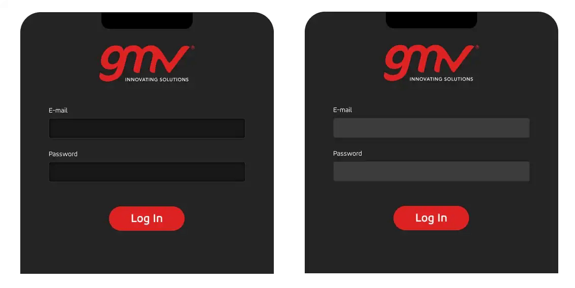
One thing we can say with certainty is that even if it might seem strange in digital contexts, it’s not a good idea to use pure black (#999999) or pure white (#FFFFFF). Why not? The answer is very simple: those colors in their purest state can make text harder to read.
In fact, most interfaces designed in dark mode don’t use pure black. Instead, they use very dark shades of gray. For example, Material Design recommends using the gray tone #121212. We’ve used this for some of our projects and found that it really does combine better with other shades of gray and other colors, as a way to create better contrast.
Preserve your brand’s colors
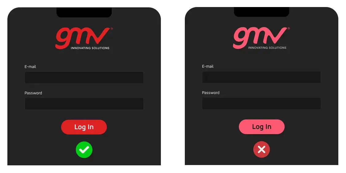
One of the main challenges you’ll probably face when you start designing for dark mode is the need to adjust your color palette. In our case, for example, our branding used some colors that were very dark and very saturated, which meant that they generated almost no contrast against the background of the interface.
The solution is not as simple as just reversing the colors, however, which is actually something you should never do. It would be a big mistake, not only because your brand would completely lose its identity, but because the hierarchy levels you’ve established in relation to those colors would also be affected. Also, if your brand’s colors are not properly adjusted, your website may be hard to read as well.
So what should you do if you have very dark colors that don’t generate good contrast? The best thing to do is to try adjusting their saturation, but be careful not to make the saturation too high or too low, because this will have an impact on your website’s accessibility.
Contrast tools = your new best friends
As you may have figured out by now, when it comes to dark mode, contrast is everything.
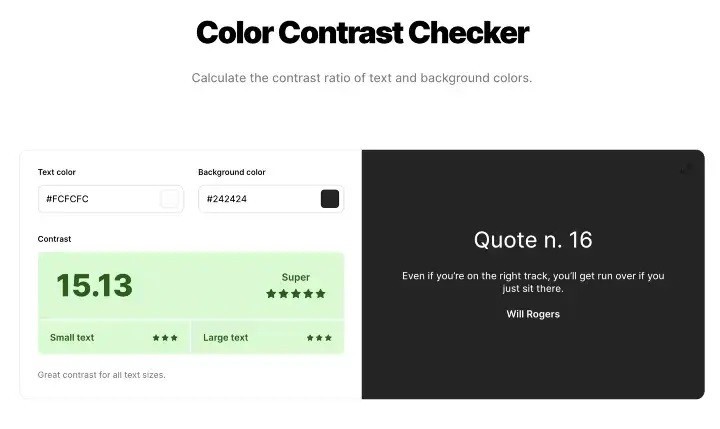
To help you find the perfect balance, there are some websites where you can simply enter your color codes, and the site will give you the corresponding contrast ratios. These tend to be very visual tools, and they can tell you right away whether the colors you want to use in your design comply with the Web Content Accessibility Guidelines (WCAG).
Some of the most popular sites offering this feature are:
-
webaim.org : In addition to the contrast ratio, this website tells you whether the colors you’ve selected comply with the WCAG AA and WCAG AAA accessibility guidelines, for a variety of text sizes.
-
coolors.co : By giving this website a sample of your background color and the text color you’ve selected, it will tell you whether you have enough contrast, and give you some suggestions on how to improve your ratio by modifying saturation of the colors.
-
material.io : This is the tool offered by Material Design, and although it doesn’t give you a contrast ratio value, it helps you configure your color palette and determine whether or not your texts have sufficient contrast.
If you’re using these tools for the first time, remember that according to the WCAG, the contrast ratio between your background color and your normal-sized text should be at least 5:1, and for larger text sizes (approx. 24 px), that ratio should be more than 3:1.
Finally, if your interface will be displaying error messages, try to give them high contrast, because this will make them more noticeable for the user. Material Design suggests the color (#B00020) for errors, over a 40% white background. Don’t worry, they also give you the actual color code so you don’t have to play around with shades of white: #CF6679 will give you conformance with the accessibility standards at the AA level.
Will there be shadows?
Although when designing in light mode we talk about shadows, in dark mode we don’t. After all, if we’re in the dark, how can there be shadows?
Instead, with dark mode we talk about elevation and depth, and creating these will help you give your designs a better visual hierarchy.
The best way to do this is by using a system of color layers that are on the same color scale as the background you’re using. For example, if you want to elevate an element and you have a dark gray background, try using a slightly lighter shade of gray in the area under the element you want to highlight, in the area that would be the “shadow”. On the other hand, if you want to generate depth, use darker shades of gray.
Let the users decide
Finally, keep in mind that this subject can be a bit controversial, so before you start designing a dark mode interface, it’s important to think about whether your product and your users will actually benefit from it.
The most important point to remember is that in general, users want to have control over what they are seeing, and over the way they interact with their various products. What we suggest is to give your users the option of activating and deactivating dark mode, because there are many reasons why they could benefit from both types of interface. As mentioned above, some people might prefer to use dark mode when working at night, or when their surroundings are fairly dark. Dark mode is also ideal for entertainment, so users can feel like they’re watching a movie at home. Have you ever noticed that all of the various platforms we have available for that purpose are designed in dark mode? It’s because people prefer to relax in surroundings with less light. In contrast, some people will also prefer interfaces with light-colored designs when working, because it makes them more productive.
What is also undeniable is that both modes can offer advantages for people with certain visual disabilities. Because of this, we would encourage you to think about the benefits of giving your product both options, and also whether those benefits will be worth the extra effort it will take to design both interfaces.
We hope you’ve enjoyed this article!
If you’d like to contact us, please send an email to
[email protected]
More information about our work: https://www.gmv.com/en-es/uxui-front-end